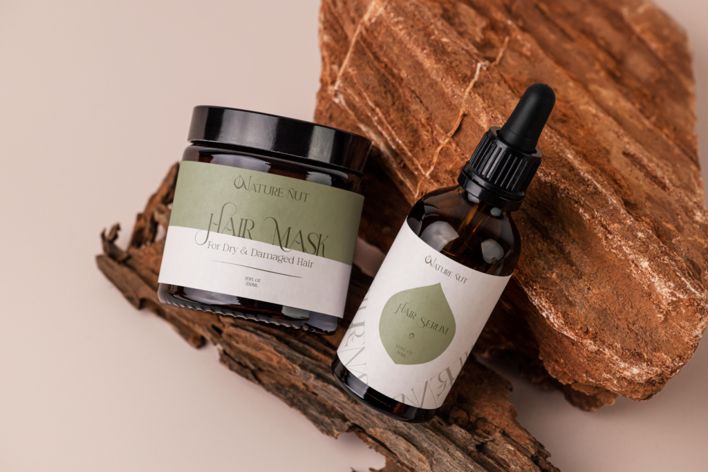
I recently undertook a rebranding project for a company named “Nature Nut.” In my opinion, the previous design was lackluster and failed to reflect the natural purity, body health, and pleasant aroma that the company stands for. My goal for this project was to capture the essence of the nut in the company’s name, as I believe a nut symbolizes the marvels of nature and its health benefits. Through this rebranding, I aimed to create a fresh and vibrant visual identity that truly embodies the company’s commitment to nature and well-being, making it more appealing and representative of their core values.


